Sunday, 7 September 2014

WEEK 6 - Ideas Behind Island Video

The following explanations are from a series of websites.  As you will see in my video, I refer to mother nature (Gaia) because of its significant connection between the main tree and the island.  No, Yggdrasill is not a made up word, rather it is the tree of life in my island that is the heart, mind and spirit of the island.  The colours blue and purple are used throughout the island and these colours reinforce the tree's significance and the island's spirituality.
 
The Gaia hypothesis, also known as Gaia theory or Gaia principle, proposes that organisms interact with their inorganic surroundings on Earth to form a self-regulating, complex system that contributes to maintaining the conditions for life on the planet.
Yggdrasill, Old Norse Mimameidr, in Norse mythology, the world tree, is a giant ash supporting the universe.
 
Purple:

Purple is the colour of Spirituality. It urges us to find our power within, not the kind of power that needs to control or dominate others, but power rooted in connection to Spirit.
Purple is associated with wisdom, dignity, independence and creativity. Purple has been used to symbolize magic and mystery.
 
Blue:
Blue is the colour of the sky and sea. Light blues suggest tranquillity and spiritual awareness. They emanate tenderness.  Blue is considered beneficial to the mind and body.
 
http://marvel.wikia.com/Yggdrasill
 

WEEK 6 - Video, Cryengine link and lecture review


For better quality please visit the YouTube site at: http://youtu.be/HWkEzRbBlJ8


To access my island in Cry engine 3 follow the link to Drop Box: https://www.dropbox.com/sh/g2up9hvpdo9gqbx/AACFGtq4vK6KiToL1KGq2GN9a?dl=0


Lecture Review

Week 6 lecture was interesting because for the most part of it I didn't know what was going on.  Throughout the week I was able to grasp an understanding of Flow graphs and with the help of YouTube tutorials, I believe I was able to create some interesting sequences.

WEEK 6 - Image Captures of Island and reflection of lecture


This image shows the moons in the distance, the cliffs and trees in the middle ground and the 'magnetic tree' in the foreground.


This image shows the 5 orbs of light beaming through my dense environment


This picture shows the key waterfall through the roots of the magnetic tree

Lighting and material effects in the vegetation
 
5 Moons


Change of Day Time - What do you think of the difference between night time environment and this time.


 Lecture Reflection
In the week 6 lecture movies such as Jaws and Inception were shown to give the students ideas about how to film their environment and turn it into a successful trailer.  From the week 6 lecture I gathered that it would be smart to leave the trailer as a guessing game for the viewer.  I would also like to create a very strong sense of suspense.


Saturday, 6 September 2014

WEEK 6 - Flow Graph


The Flow Graph below triggers a gust of wind when the camera is guided through the proximity trigger of the glowing tree.


The Flow Graph below triggers a gust of wind when the user walks into the illuminated vicinity of the glowing tree.


This Flow Graph is a failed attempt of trying to make sounds that I made in-game come alive in the capturing sequence.  I understand now that the sounds wont be captured because the sequence is recording images.


Friday, 5 September 2014

WEEK 6 - Example of Clean Interface

In the following link, I am showing how to film using fraps and without added extras on the screen
 
This video is also a good example of how the wind is triggered at the end of the video by a flow chart...CHECK IT OUT

Thursday, 4 September 2014

WEEK 6 - Marking Sheets


WEEK 5 - Outputs and reflecting on lecture


OUTPUTS: 1 x 120 second (max!) video clip, 1 x Blog with completed weekly tasks, 1 x Crysis Free SDK folder containing all of the required files to "play test" your work.

"Complete a full draft of the outcomes required for EXP1. See the OUTPUTS section of the EXP1 brief for what is required; a full draft includes all of those outputs. While each of the outputs might not be finished they do need to present a clear indication of the strengths and opportunities of the scheme."


This link provides you with a temporary video of my island clip
 
This link provides you access to my island at its current stage in progress.
 
Obviously my blog is open to the public.  Therefore all the output requirements are listed here.  I will be uploading updated examples on the 7/9/14.
 
 
Reflecting on Lecture
 
Week 5 presented a lecture on 'The Subliminal'.  From this lecture I personally gathered knowledge on different ways to portray my combinations.  More importantly, it made me think about how abstract I wanted to make my combinations to try and separate myself from the other students.
 

WEEK 5 - Revealing and Concealing Strategy

I want the person exploring the island to be totally engulfed in the experience and to be unaware of the subtle messages that are surrounding him/her. The letter/number combinations become increasingly larger in size and more sophisticated/ abstract in construction as the viewer approaches the centre of the island (glowing tree).

The combinations will be revealed in a series of cameras that catch a certain angle which reveals the letter or number. Combinations that can be seen from ground level will either be concealed by fog or trees until an opening arises.  Additionally, the combinations seen from ground level are so subtle or abstract that the explorer won’t realise the messages being presented.

The letter/number combinations will be concealed through perspective angles, camera flare editing, layer painting, vegetation shaping, entity multiplying and noise related circumstances.  All of the concealing strategies shape an unusual and versatile range of hints for the explorer to experience.  Due to the complexity of the island, most letter and number combinations will become obvious once the viewer steps into the game.
Refer to 'Week 5 - Subliminal Letters and Numbers


WEEK 5 - Subliminal Letters and Numbers


My letter and number combination is B5. 'B' standing for the last letter of my last name: Tebb. '5' standing for the last number in my student ID: z5020695
 
 
I found it challenging to create my combinations because my environment does include any architectural elements.  Constructing the combinations out of the environment only was tedious but I like how there is a sense of consistency running through the island.  There are a series of combinations placed throughout the island, some on an X axis and others on a Y axis.  The combinations sitting on an X axis are viewable from higher ground or a birds eye view and the Y axis combinations are viewable from ground view. 
 
2 Toads (B)  MICRO
 
Two toads grouped together on the ground represent the second letter of the alphabet (B).


  Birds (5)    MIRCO
Five birds circle above the toads to represent the number 5 in my ID

 
Flow Bed (B)   MICRO+
The flower bed blends into the environment at eye level and is exposed from a birds eye view. 


Rock Formation (5)    MICRO +
 
Like the flower bed, the rock formation is viewable from a higher view but blends into the environment on ground level.


Land Mark    MICRO/MACRO
The landmark is a slightly larger letter and number combination that is only viewed from a distant bird eye view, from a close up view, it looks completely natural.
 

Vegetation and layer Painting (B5)   MICRO/MICRO


 In this example, the bushes create the 5 and a combination of tree, bush and layer painting creates the 'b'


Land and Island Formation (b5)    MACRO-
 
The 'b' is created from bushes and the 5 is represented by the number of islands in the water.


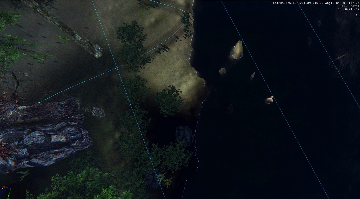
 Ground Lighting - illumination (B)   MACRO-
 
At ground level the lights simple illuminate the blue flowers, as we begin to zoom out the 'B' shape is more obvious.


Rock Face and Waterfall - '5b'    MACRO -
 
This is one of my favourite letter and number combination spots because I believe it responses to the subliminal theme positively well.


Lens Flare - Orbs (5)    MACRO-
 

I set up a lens flare to be attached to the purple light of the tree, there are 5 orbs that come off the flare of the light.

 
Moons - (5)    MACRO
  
To represent the Macro size combination I positioned 4 smaller moons around my main moon which adds up to a total of 5 moons.


Island - (b)    MACRO
 
An even larger macro size letter indication is the 'b' shaped island


Wednesday, 3 September 2014

WEEK 4 - Editing the Sky

I decided to alter the default sky settings rather than using a sky template.  After fiddling around with most of the settings found in the 'Time of Day' tool bar I was able to create a green/blue coloured sky and a light aqua coloured moon.  The global fog settings are altered so that the fog stops at 2000metres which doesn't block the view of the moon from ground level.  The fog is a also a tinge of dark blue because I was trying to recreate an atmosphere that can be found in my references images in week 2.


These screenshots of my sky's technical parameters show how much I have altered the original settings.

Monday, 1 September 2014

WEEK 4- Fog Rain Waterfall

 
The videos are quick examples of my use of rain, fog and a waterfall in my environment.
 
For the full video visit: http://youtu.be/-gYH-JiHYJc


WEEK 4- Examples of Sky

Cloudy Day

Evening

Rain Clouds

Grey Clouds

Each image shows different sky environments and I still feel as though the default sky settings suits my environment the best

WEEK 4 - After Sky Alterations

Sky Alterations


I was unsatisfied with the turnout of the sky alterations, so I decided to return with my original sky settings with the extra large moon and occasional clouds.  Keeping the original sky settings creates a greater atmospheric experience.

WEEK 4 - Original Sky Images


Image From lecture


As you can see the night sky doesn't reveal much apart from a few clouds and a giant moon.  When the daytime settings are adjusted and the clocks are set back a couple of hours the sun hits the moon in an interesting way and highlights it better.


Church of Light Movie and Strategy Statement

https://www.youtube.com/watch?v=5vX5cPwC0UU To highlight the complexity inherent within decaying structures, I utilised 22 unique texture...